This month I am taking part in a month of spooky, sinister and scary posts, a theme put forward by fellow blogger Curtis Evans. The definition for this theme is a loose one, so anyone wanting to participate can interpret it as freely as they want to. I am continuing my focus on scary vintage mystery fiction this week by taking a look at some of the cover artwork used.
However, before I dive into that I need to announce the results of the poll I ran last week on which vintage mystery novel setup was the most frightening.
In first place gaining just under 25% of the votes was And Then There Were None. Cut off from civilisation and the police, unsure of who you can trust, and a killer on the loose make Christie’s island an unappealing get-away destination. The titles which achieved second and third place, The Whispering Wall and Puzzle for Fiends, both have in common obstacles which the protagonist cannot simply fight against, in the way you can an assailant. In fourth place we have Ethel Lina White’s Wax, and I wonder whether the setting of this one added to its sinister atmosphere. Hot on this book’s heels was The Nine Dark Hours and four titles ended up sharing 6th position, (Some Must Watch, The Red Widow Murders, The Last of Philip Banter and Follow as the Night.) The remaining Carr title in the list, The Judas Window and Ursula Curtiss’ The Deadly Climate, made it to 7th and 8th position respectively. Interestingly we even had a blog reader comment that they would quite enjoy being in scenario of The Judas Window and The Red Widow Murders. All I can say is be careful what you wish for… Neither Step in the Dark nor The Man Who Was Not There gained a vote. This is not too surprising as you would have to be pretty foolish to end up in the predicament of the heroine in Step in the Dark.
Today’s post will be in two parts. The first section, as you can see, is another poll. This time though I am asking you to decide which is the best cover with a skull on. You may select any criteria you like for deciding: Which is the scariest? Which is the most aesthetically pleasing? Which is the most relevant to the novel? Which is the most creative?
Like last week you get three votes to cast.
I have tried to include examples from a range of publishers. Keen fans of classic crime will not be surprised by the inclusion of two titles from the Rue Morgue Press, for whom the skull/skeleton was an important motif. This selection of ten is by no means a top ten, although the Dutch edition of The Body in the Library, is one I find highly memorable.
The second part of this post was not one I had planned to do when I first mapped out my posts for this monthly theme. However, as I was searching on Google for suitable covers for this week’s poll, I naturally came across a lot of Agatha Christie covers. Often I found myself evaluating them as I saw them, regarding some more favourably than others, whilst finding others more generic and redundant. Looking at them as a group I felt there were some possible lessons we could draw from them, so here is my very brief rules on how to do skull covers well…
- Embed your skull into the rest of the cover artwork.

Whilst a superimposed skull can be quite shocking and stark, I think a more eerie sinister feel can be created by making the skull part of the whole picture. This one works especially well as the skull is made partly out of the apple – which has direct links to the main murder of the book. Conversely, the skull covers below are all examples of a lazy cover. None of these skulls feel connected to the books they are promoting, and they do not give you any sense of what they might be about.


2. Use your skull atmospherically.


The two examples here add more of a sinister effect using one of two techniques. The cover of Sparkling Cyanide uses its’ colour scheme effectively and the positioning of the skull on the cover Hercule Poirot’s Christmas put me in mind of a deadly Santa Claus.
3. Be creative.

Creating a skull out of non-bone material can be used quite effectively on covers, as the unorthodox material can be linked to the contents of the novel. I think this works well here, and those who have read the book may also see an additional clue in this particular skull.
4. Be suggestive.

This is probably a bit of cheat, but I think this cover is a good example of how less is more. The reader does not need to see the whole skeleton and skull, to imagine what is on the other end of the skeletal arm we can see. The focus on the hand/finger also in some ways suggests a sense of fate and impending doom, which fits in with the plot of the book rather nicely.
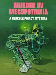
How not to be suggestive: It is important to make sure you are suggesting the right thing. For me the cover for Evil Under the Sun gives a bizarre Western/desert vibe to the novel, (the scorpion really doesn’t help), and the cover for Murder in Mesopotamia, with its focus on treasure made me think of pirates!!

What do you think? What other criteria help to make a skull cover successful? Do you have any favourites which have not been shown in the post?

I like the America Mystery Classics “Death from a Top Hat” and a “Taste for Honey” which both feature skulls, as do the cover art for some earlier versions.
LikeLiked by 1 person
Oh yes, I had forgotten about the AMC covers. Thanks for reminding me of them.
LikeLike
Those are both great!
On the AMC note, I just noticed after over a year of looking at it that the tunnel and train lights in the Dread Journey cover form a skull too!
LikeLike
Good spot – I don’t have that one but have seen the cover a number of times and never noticed it.
LikeLike
It is done very well!
LikeLike
I enjoyed this post. I did vote (for three), but in the top list my favorite skull cover is the one on Holiday Homicide by Rufus King. 2nd runner up is The Dead Can Tell. I am pretty sure that artwork is by Gerald Gregg, who did my favorite Dell Mapback covers.
In the other covers, the one I would most like to own a copy of is Sparkling Homicide.
My favorite skull cover is on a hardcover edition of King & Joker by Peter Dickinson. The Gideon Oliver series by Aaron Elkins has some nice skulls and skeletons on the covers. Although I have only read a couple of the books, I own copies of many of them for the covers.
LikeLiked by 1 person
Thanks for sharing your favourite covers. I believe you collect covers with skulls on? I did imagine you looking at the list and going “Got it, Got it, Got it” lol I have not come across the Peter Dickinson cover before – I can see how it would make for a memorable design.
LikeLike
I do collect books with skulls or skeletons on the cover. Unfortunately, I only have 4 of the covers you show in this post. Another one I would really like to have is the Halloween Party by Christie. That is a Tom Adams cover, and I love almost all of his covers.
Another group of books I would like to have all of is the Rue Morgue Press editions of the books by the Little sisters. Not just for the covers of course.
LikeLiked by 1 person
I have a few of the RMP editions of the Littles’ books. They’re not always the easiest to track down, but they do turn up on ebay and Abebooks from time to time. There’s some on at the moment, but they’re ones I already have.
LikeLike
Although it doesn’t really fit here, I’d like to include the true crime book Murder Squad by Tom Tullett, whose paperback edition features the bizarre sight of a skull apparently picking its nose…
LikeLiked by 1 person
That cover would certainly win the very niche competition of: Cover which depicts the most weird illustration of a skull!
LikeLike
Considering how Agatha Christie and her husband spent so much time on archaeological digs, they probably encountered a lot of genuine skulls. Skulls left right and center. So. Many. Skulls. Surely up to their ..er.. skulls in skulls.
“Oh Max, we’ve just dug up another skull!”
“Oh, Agatha, how marvelous! Throw it on the pile with all the rest, my dear!”
LikeLiked by 1 person
Well at least it would have provided some deviation from the endless amount of pottery fragments they would dig up!
LikeLike
I remember that cover of The Hound of Death on my father’s bookcase and feeling utterly freaked out by it every time I saw it! 😀
LikeLiked by 1 person
Well maybe it was doing its’ job after all lol
LikeLike
[…] Rufus King’s Holiday Homicide and Mary Robert Rinehart’s The Red Lamp. Check out the original post to see these sinister […]
LikeLike
I came too late to vote, but loved looking at these and looking up the ones the comments mention. Like Aidan, The Hound of Death was part of being spooked as I grew up – it has NEVER occurred to me that it was irrelevant to the content! It is forever associated with those scarey stores in my mind. So yes, it did its job!
LikeLiked by 1 person
Interesting. So perhaps THoD cover was aimed at a younger audience? Hoping it doesn’t still spook you lol
LikeLike